

Client:
Sydney Water
2020
Sydney Water
2020
Interactive
concept campaign pitched to Sydney Water. Concept packaging and
interactive poster design aimed to reduce water consumption and empower
Aussie homes to shift into half flushing habits.
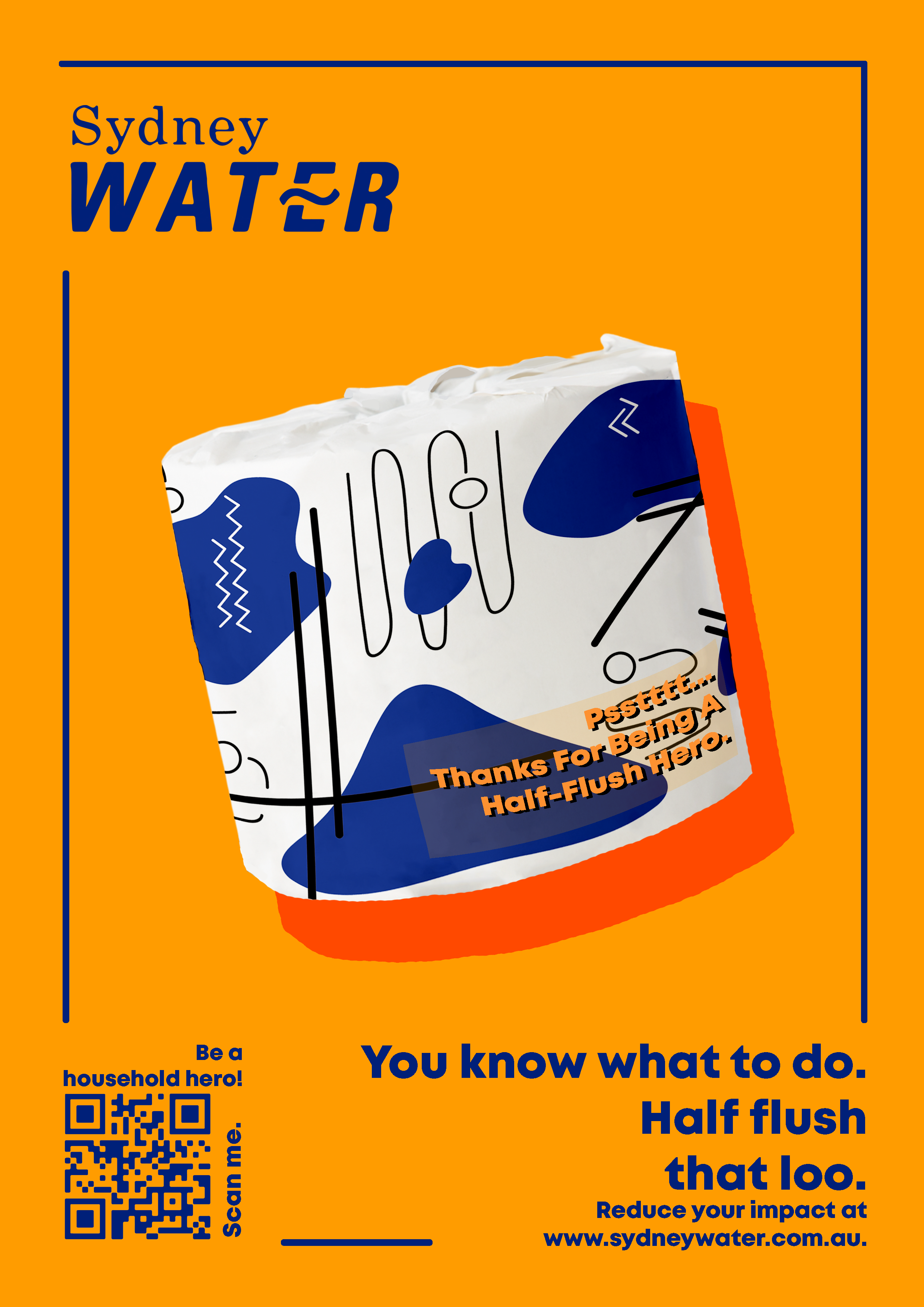
It’s 100% recycled toilet paper that aims to reduce the impact of toilet water consumption within households through positive vibes, superior ethics, and fun printed and reusable packaging. On the packaging, the consumer is kindly reminded to use a half flush rather than a full flush in a humorous and light-hearted way, in order to appeal to the target audience rather than shame them for their water wastage.
It’s 100% recycled toilet paper that aims to reduce the impact of toilet water consumption within households through positive vibes, superior ethics, and fun printed and reusable packaging. On the packaging, the consumer is kindly reminded to use a half flush rather than a full flush in a humorous and light-hearted way, in order to appeal to the target audience rather than shame them for their water wastage.
The print is a minimal and abstract interpretation of
the movement of water in our homes and Australian pipelines. Visually and
contextually, it’s a kind and bubbly way for the consumer to feel rewarded for
their water consciousness and good behaviours. In effect, it results in a
motivation to positively alter and permanently change their habits.
The final screen designs are a series of posters that promote half flushing the toilet. The posters are extremely eye-catching, by employing bold contrasting colours to represent a celebration of life and the energy of happiness. The bottom right corner of each poster includes a punchline dedicated to half flushing. These little rhymes are easy to remember and quite catchy. They also help to promote the good in half flushing, as well as promoting an external link to Sydney water by an interactive QR Code.
The final screen designs are a series of posters that promote half flushing the toilet. The posters are extremely eye-catching, by employing bold contrasting colours to represent a celebration of life and the energy of happiness. The bottom right corner of each poster includes a punchline dedicated to half flushing. These little rhymes are easy to remember and quite catchy. They also help to promote the good in half flushing, as well as promoting an external link to Sydney water by an interactive QR Code.